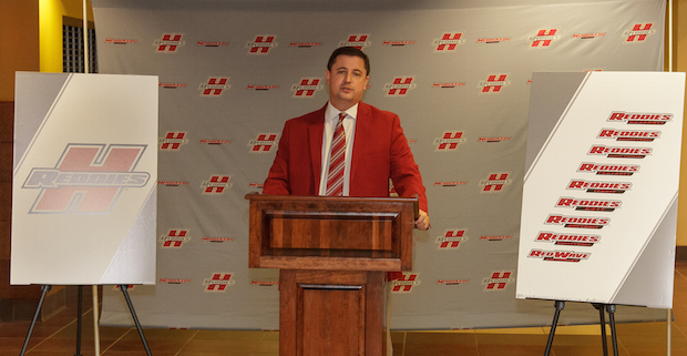
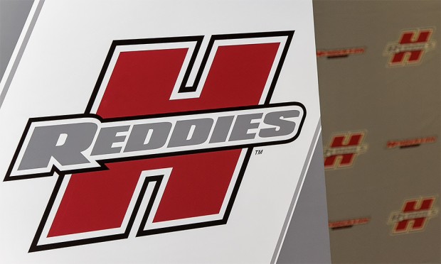
Henderson State’s iconic “H” logo has undergone a facelift to reflect a modern vision for the university’s Department of Athletics and the Reddies. The new, slanted “spirit mark” stands as the highlight of the department’s brand enhancements, introduced at a press conference July 15.
“The modernized ‘H’ faces forward because we are working hard every day to move this department forward,” said athletic director Shawn Jones. “It has taken on many looks over the years. The Reddie Spirit has always been bold and full of class. We feel like we’ve found a great way to symbolize that insurmountable Reddie Spirit now and into the future.”
The department’s redesigned website will reflect the new branding and other enhancements.
“One of the priorities within Henderson’s strategic plan is to enhance the university’s regional, state, and national profile,” Jones said. “The athletic department’s brand enhancement, along with the success of our student athletes both on the field and in the classroom, will provide clear messaging to our external audiences and will help unify the overall Henderson brand.”
Frank Keenan, assistant athletic director for marketing, said a unifying athletic brand was needed.
“We had a set of logos and images, but it wasn’t consistent” he said. “It didn’t give an overall message of who we were as an athletic department.”
Keenan said each sport now has its own logo that is consistent with the new brand.
“We needed consistency across Henderson State’s 12 sports,” Keenan said. “The ‘H’ itself hasn’t changed greatly, but it has been modernized. We didn’t want to go far away from the ‘H’ because of people’s affinity with it.”
Keenan worked with Learfield Licensing to develop the new look. “As the new branding comes out, there will be a consistency both in graphics and imagery,” he said. “When people see it, we want them to know it’s Henderson State. That helps us in recruiting and from a marketing standpoint.”
The rebranding coincides with several athletic facility upgrades. “This is a good time for the rebrand,” Keenan said. “It’s been a time of high achievement and positive change within the athletic department, and we feel this goes hand-in-hand with those changes.
“We want a strong brand that our student athletes are proud of. We want them proudly wearing our gear because they’re our biggest salespeople. And we want our alums, supporters, faculty, and staff to wear the ‘H’ and be proud of it.”
The revised athletic website takes advantage of new technology that has emerged since the site’s initial development six years ago.
“The web has become the first port-of-call for most people now, especially prospective students and their parents. Six years ago, it wasn’t,” Keenan said. “We wanted to take advantage of the new technologies now available.”


